Everyday Data Jadoo Big Data Blog

Pi Visualized as a Public Urban Art Mural

visualize_pi

Visualize Pi [tumblr.com] is a mural project that aimed to use popular mathematics to connect Brooklyn students to the community with a visualization of Pi. It was funded by a successful KickStarter projectas proposed by visual artist artist Ellie Balk, The Green School Students, staff and Assistant Principal Nathan Affield.

The mural seems to consist of different parts. A reflective line graph, reminiscent of a sound wave, represents the number Pi (3.14159…) by way of colors that are coded by the sequence of the prime numbers found in Pi (2,3,5,7), as well as height.

Additionally, a golden spiral was drawn based on the Fibonacci Sequence, as an exploration of the relationship between the golden ratio and Pi. The number Pi was represented in a color-coded graph within the golden spiral. In this, the numbers are seen as color blocks that vary in size proportionately within the shrinking space of the spiral, representing the ‘shape’ of Pi.

By focusing on the single, transcendental concept of Pi across courses, the mathematics department plans to not only deepen student understanding of shape and irrational number, but more importantly, connect these foundational mental schema for students while dealing with the concrete issues of neighborhood beautification and how proportion can inform aesthetic which can in turn improve quality of life.

A few more similar urban / public visualization projects can be found at Balk’s project page, e.g. showing weather patternsemotion histograms or sound waves.

visualize_pi2 visualize_pi3 visualize_pi4 visualize_pi5

Vis Potpourri, September 2017-Author ROBERT KOSARA

brainsplode-big

A potpourri is a collection of spices and plants that create a pleasant aroma together. This new series assembles a list of links to recently interesting things in visualization, from both information visualization (InfoVis, which I normally cover on this site) and scientific visualization (SciVis) – the latter covered by new blog collaborator and medical visualization assistant professor, Noeska Smit

The items below are an unordered mix of SciVis and InfoVis on purpose. The goal with this type of posting is not to be the all-encompassing Complete List of Everything that Andy Kirk tends to post, but to be much more selective and opinionated.

Steve Haroz has put together a great collection and analysis of Open Access papers that will be presented at the IEEE VIS conference in early October. On the oavis page, you get an interactive overview of the available PDFs, materials, data, and explanations, for each of the VIS tracks per session. Steve is handing out Open Access badges per paper, and it seems SciVis and VAST are lagging behind InfoVis quite a bit. Also check out Steve’s detailed analysis here.

Kitware’s VTK (visualization toolkit) had a new major release this summer: VTK 8.0.0. While larger updates to the rendering process were a focus in the 7.x.x series, 8.0.0 also brings improvements such as a Vertex Buffer Object cache, GPU volume texture streaming, and an improved dual depth peeling pass. Other key items in this release include the introduction of VTK-m, a Lagrangian particle tracer, a new QVTKOpenGLWidget, and improved data loading for large files.

Speaking of toolkits, Elijah Meeks has released a new data visualization framework for ReactJS, called Semiotic (here’s a nice little introduction). It’s an interesting approach to building visualizations for the web, and particularly interesting if you’re already using React. Coming from Elijah, the tagline is no surprise:

Semiotic is an opinionated framework optimized to enable effective communication through data visualization.

The Dear Data project made huge waves last year. It’s no longer just a beautiful book, Giorgia Lupi and Stefanie Posavec have just released a postcard kit to get you started on your own data correspondents project. The kit includes not just cards, but prompts and ideas for what to collect data about. This would make a great gift, say for your favorite visualization blogger.

Lisa Charlotte Rost tells a story with data about how vote counts turn into parliamentary seats in Germany. She does not use visualization, steppers, or scrollytelling, however. Instead, it’s a spreadsheet. For this kind of detailed walk-through, this is a very interesting idea, and very effective. You can see the calculations in each cell to see more detail than is in the explanation.

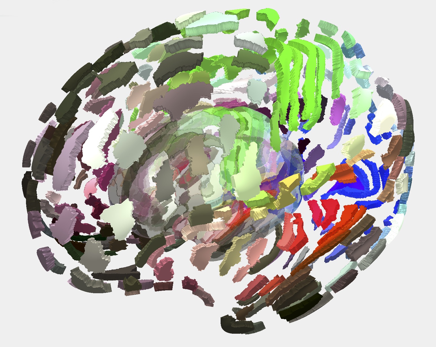
Emma Robinson has written up a great SciVis blog post on her recent work on The Cortical Explorer. She describes the features of this online brain explorer, the motivation behind it, and future plans, in an easier to digest format than you would find in a paper. You can now also play around with this brain yourself in your browser and make it explode as you see fit! I really hope to see more such blog posts in the future, because these ‘science in plain English’-type of posts can also be of great interest to a broader audience.

The short video Unendurable Line is a fascinating exercise in showing a sort of data together with the phenomenon it’s based on, plus sound, in real time. It’s impossible to explain, you have to watch it. It’s worth two minutes of your time, though, and I don’t say that lightly about videos.

And that’s a wrap for the first Vis Potpourri! Let us know if you like the format and if there’s anything you think we should change.


The Author

Robert Kosara is a Senior Research Scientist at Tableau Software and formerly Associate Professor of Computer Science at UNC Charlotte. He has created visualization techniques like Parallel Sets and performed research into the perceptual and cognitive basics of visualization. Recently, Robert’s research has focused on how to communicate data using tools from visualization, and how storytelling can be adapted to incorporate data, interaction, and visualization.

Robert received his M.Sc. and Ph.D. degrees in computer science from Vienna University of Technology (Vienna, Austria). His list of publications can be found online on his vanity website. He can be found on TwitterLinkedIn, and Google Scholar. You can also use this site’s contact form to send him an email.

What happened in the recent German election?

Karte_der_Reichstagswahlen_1912_en

Divya Schäfer writes:


 am not a statistician, but a historian by training. However, I have a lay interest in election analyses, among other topics covered in your blog.

I live in Germany. Yesterday, the federal elections were concluded, as you may have heard. I was wondering if you could share your views on it on your blog?

A bit of background: Many of the results were expected, but some were surprising. Chancellor Merkel’s party was the largest, as expected. On the other hand, particularly unexpected was the extent to which the major parties were weakened and the strong performance of small parties, particularly the radical right-wing Alternative for Germany (AfD), which ended with 12.6%. It is strongest in eastern Germany. This is seen as a reaction to Merkel’s refugee policy, but probably has deeper roots.

Germany’s overall prosperity has also meant that the Left parties have found it difficult to push their message as strongly as they would have liked. According to some graphs they showed on TV yesterday, economic concerns like employment played a smaller role for voters than in previous elections. At the same time, there are many who feel left out. The German electoral landscape has changed, and analysts have offered various explanations for this. Is this speaking too soon? Maybe these elections represent only a blip rather than a rightward shift?

Germany has a proportional representation system, explained here.

Studies of German voting behaviour have been analysed in many scholarly works, which suggest both a generational effect as well as a life-cycle effect (sorry, I could not find English language resources for this). I think this has something to do with the proportional representation system. German voters change their choices from election to election more often than American voters, a phenomenon known as “Wählerwanderung”. This article (link here) from the Financial Times has some nice graphs on the German elections.

We see, for instance (based on fairly accurate exit polls), that the AfD has taken votes from all sorts of sources. Mostly it has mobilised non-voters, but has also taken substantial chunks from the CDU/CSU (Conservatives, also Merkel’s faction) and the SPD (Social Democrats). Even the Linke (Left Party) has lost as much as 11% of its voters to the radical right-wing party.

I have no idea; I know nothing about German politics beyond what I read in the newspapers. But it can be a good idea to blog on things I know nothing about. So feel free to comment, everyone!

Page 1 of 1212345...10...Last »

BLOG POSTS

ADDRESS

650 Parliament Street, Toronto,Ontraio, Canada
Phone: (416) 939-0044
Fax: (647) 720-2214
Website: http://www.datajadoo.com
Email: info@datajadoo.com

DISCLAIMER

Important:: This site has been setup purely for showcasing the analytic's skills of Data Jadoo. All the content are designed by Data Jadoo. Author retains his or her views on the topics expressed here. All images are copyrighted to their respective creators.